The Producer Scorecard Your MGA Should Be Using
If your producer performance report is just a ranked list by premium volume, you're managing your distribution network with one eye closed.
Every MGA has a producer performance report. It usually looks like this: a ranked list of producers sorted by total premium volume, maybe with a column for submission count and another for commission paid. The #1 producer gets the most attention, the most co-op marketing dollars, and the best service from the underwriting team.
The problem is that this report answers exactly one question — “Who sends us the most business?” — and ignores every question that actually matters for profitability and growth.
Volume Is Not Value
Let's take a real example (names changed). An MGA with 180 appointed producers had their distribution team focused on the top 20 producers by submission volume. These 20 agencies generated 55% of all submissions. Seemed logical to invest in them — more submissions should mean more bound premium and more revenue.
When they built a multi-dimensional producer scorecard, the picture changed dramatically:
- Their #1 producer by volume (420 submissions/year) had a 9% hit ratio. For every 100 submissions, they bound 9. The underwriting team was spending significant time on this producer's submissions, and 91% of that effort produced no revenue.
- Their #1 producer by hit ratio (52%) ranked #38 by volume. This agency sent only 80 submissions per year, but over half of them bound. Their loss ratio was 42% — dramatically below the book average of 61%.
- Three producers in the top 10 by volume had loss ratios above 80%. They were sending high-converting but high-loss business — exactly the kind of growth that erodes profitability over time.
The MGA had been investing in the wrong producers for years. Not because they didn't care about profitability — but because the only data they had was volume.
The Five Dimensions of Producer Performance
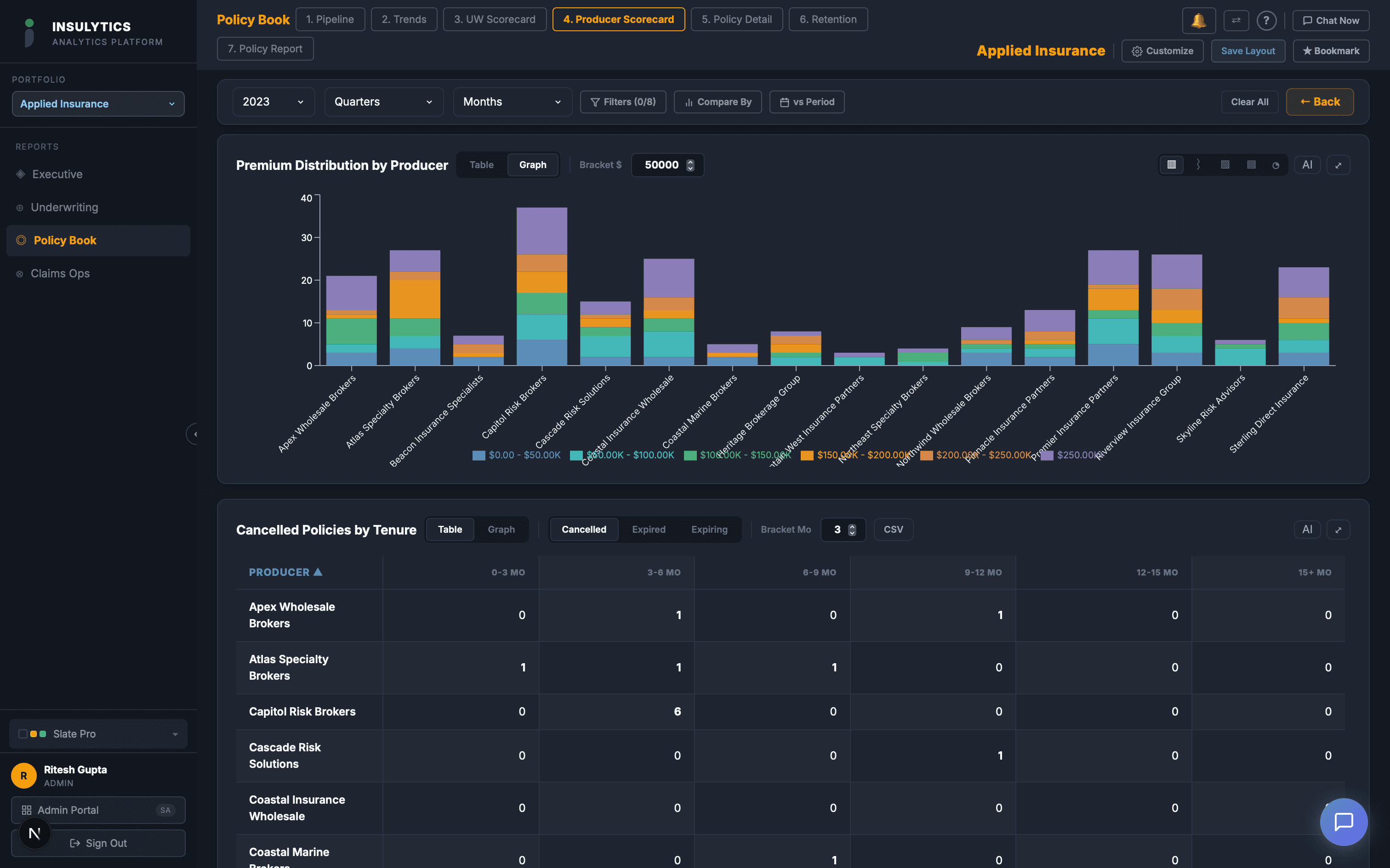
A useful producer scorecard needs to capture five dimensions simultaneously. No single metric tells the story; the value is in the combination.
1. Submission Activity
How many submissions does this producer send? Is the volume growing, declining, or flat year over year? A producer whose submission count dropped from 200 to 120 might be shifting business to another market — that's a relationship signal, not just a data point.
Also track the mix: what percentage of submissions are new business vs. renewals? A producer who sends mostly renewals is a stable revenue source. A producer who sends mostly new business is a growth engine — but only if the hit ratio supports it.
2. Conversion Efficiency
Hit ratio is the most important metric most MGAs don't track by producer. It tells you how efficiently the underwriting team's time is being used on each producer's business.
Break it down further: what's the clearance rate? The quote rate? The quote-to-bind rate? A producer with a 15% overall hit ratio might have a 90% clearance rate but a 17% quote-to-bind rate — meaning the business is appropriate for your appetite but the pricing isn't competitive. Or they might have a 50% clearance rate — meaning half their submissions are outside your guidelines and the producer doesn't understand your appetite.
Same hit ratio. Very different diagnostics. Very different conversations to have with the producer.
3. Premium Quality
Total bound premium is a useful number, but average premium per policy tells you more. A producer binding $2M in premium across 200 policies ($10K average) is generating very different business than one binding $2M across 20 policies ($100K average).
Smaller policies typically have higher expense ratios and higher loss ratios. If a producer is driving your average premium down, the profitability math changes even if the top-line premium looks the same.
Also track quoted premium vs. bound premium. If a producer's quoted premium is $5M but their bound premium is $800K, there's a 84% revenue leakage between quote and bind. Understanding why — pricing, terms, competition, or broker shopping behavior — is critical for managing that relationship.
4. Loss Performance
This is the dimension that separates a good distribution strategy from a growth-at- all-costs strategy. Every producer's submissions should be evaluated not just on conversion but on loss outcomes.
Track loss ratio by producer over a multi-year window (at least 3 years to account for loss development). Some producers consistently bring better risks — their insureds have better risk management, better claims histories, and fewer litigated losses. Other producers consistently bring adverse selection: risks that other markets declined, accounts with poor loss histories, or classes with inherently higher severity.
The producer scorecard should make this visible without requiring a separate analysis. When you sit down for a quarterly review with a producer, you should see their premium and their loss ratio on the same screen.
5. Cycle Time Impact
Different producers create different workload patterns for your underwriting team. Some submit clean, complete applications that move through clearance in hours. Others submit incomplete applications that require multiple rounds of follow-up, driving up cycle time and underwriter frustration.
Track average clearance-to-quote time by producer. If one producer's submissions take 8 days to quote while the average is 4 days, there's a submission quality issue. That's a coaching opportunity: work with the producer to improve their submission completeness, and both parties benefit.
The Quadrant That Changes Conversations
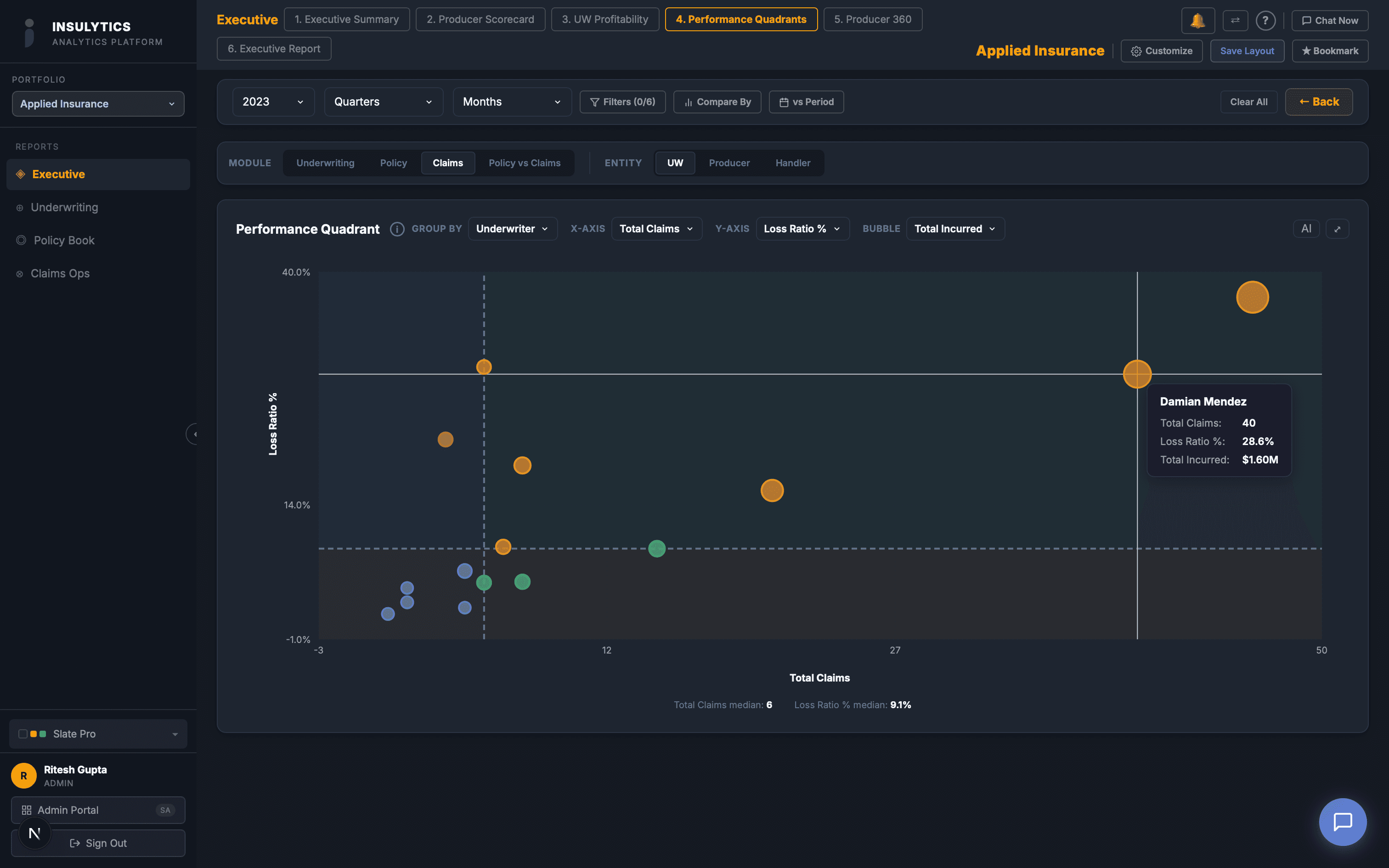
The most powerful view of producer performance is a two-axis quadrant: hit ratio on one axis, loss ratio on the other. This creates four categories:
- High conversion, low loss ratio (top right): Your best producers. They send business that converts and performs. Invest heavily in these relationships. Give them priority service, co-op marketing, and exclusive access to new programs.
- High conversion, high loss ratio (top left):Profitable to write but unprofitable to keep. These producers bring business you can bind, but the loss outcomes are poor. This calls for underwriting discipline: tighter guidelines on this producer's submissions, not termination.
- Low conversion, low loss ratio (bottom right):Underutilized relationships. The business they send that you bind performs well, but you're not converting enough of it. Investigate why: is your pricing uncompetitive for their segment? Are they not prioritizing your market? Is there an appetite misalignment you can fix?
- Low conversion, high loss ratio (bottom left):Your worst producers. Low conversion means the underwriting team is spending time on submissions that don't bind, and the ones that do bind produce poor loss outcomes. These relationships need hard conversations — or termination.
From Report to Action
The producer scorecard isn't a report to file. It's a management tool that should drive specific actions:
- Quarterly producer reviews:Replace the “how are things going?” conversation with a data-driven review. Open the scorecard on screen, walk through the numbers together, identify specific improvement areas. Producers respect data — it makes the conversation objective, not personal.
- Marketing dollar allocation: Shift co-op funds, conference sponsorships, and field marketing visits from volume-based allocation to quadrant-based allocation. Your top-right producers get the investment. Your bottom-left producers get a performance improvement plan.
- Appetite communication:If a producer has a 40% clearance decline rate, they're not aligned with your appetite. That's a training issue, not a producer quality issue. Send them your updated appetite guide, schedule a 30-minute call to walk through it, and track whether their clearance rate improves.
- Appointment decisions:Use 12-month trailing scorecard data to make termination decisions. A producer in the bottom-left quadrant for 4 consecutive quarters, who hasn't responded to coaching, is consuming underwriting capacity that could be allocated to better-performing agencies.
The premium volume report will always have a place — your carrier partners want to see it, and your board understands it. But the decisions that actually drive MGA profitability and growth happen at the intersection of conversion, loss performance, cycle time, and premium quality. If your producer scorecard doesn't show all five dimensions, you're only seeing part of the picture.